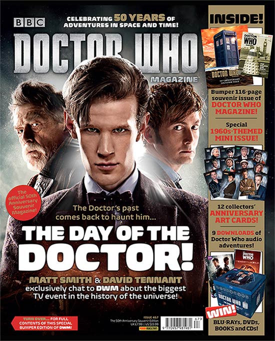
Title of Publication - The title is in the top half of the page and is centred in the middle of the page and is easily visible. Although the centre image covers some of the writing, the loyal and regular viewers of 'Doctor Who', who watch the show will show a sense of recognition with the name and would be able to identify what show it is. The name 'Doctor Who' in capital letters which is also in bold makes the brand name stand out on magazine shelves which helps it be recognised by its audience and also new viewers who may be interested in finding out more.
Slogan - The Slogan on this magazine links back to the Title of Publication as the audience get a sense of what the magazine will be about. In this case the audience will be 'Celebrating 50 years of adventures in space and time'. The slogan is placed above the Title of Publication and is centred above it. From the slogan the audience can also understand that the programme is a SCI-FI programme.This also shows how consistent and dedicated the programme has been as its been as its been 50 years and they would want the audience to celebrate it with them, as its made for their viewing
Central image - The central image of the 'Doctor' is equally important as the two side images. This is because the Slogan has already stated that it is Celebrating 50 years of the doctors adventures, and so the two other images are from the different generations of 'Doctor Who'. This also helps the reader identify what the magazine what the magazine will be about. The image can be identified by both males and females who watch the show or know the actors shown. There is also a
Flash/Cover lines - The cover line "the day of the doctor !" Links back to the front image and also the title. This is in reference to doctor who, which its intended audience would understand the referance. This cover line is also strategically placed in front of the central image and intends to advertise the contents of the magazine. This was also placed in the bottom quarter of the page. This is an example of a convention- a common device to which the audience have become accustomed and those senses they have taken for granted.
Free Offer- Magazines sometimes offer small gifts or products when purchasing a magazine. With this magazine things such as Collectable items to make the reader buy another magazine the following day these are little incentives for the reader to view or purchase the magazine.
Colour Scheme
The colour scheme that is used in the magazine is red, black, blue and white. The colour scheme is limited, which is a benefit as it prevents the magazine from looking to busy and create a particular vibe that is unique and felt by the reader and the targeted audience. The use of red is limited as it used to mainly promote the different offers, such as the anniversary art cards. Furthermore the use of black is persistent and mainly used in the background of the magazine to contrast all the other colours and make it stand out further. The use of blue is iconic as it represents the blue telephone booth for Doctor Who. The use of bronze is simple and highly effective; this is due to the fact that it connotes an ancient portrait feel to the doctors 50 years.
Name Checks
The name checks that have been used are not standard name checks as they normally give clues to other stories and articles, which may entice different audiences. However in this magazine, the name checks portray the same topic but in different methods.
Language
This magazine uses 5 different typographies. The language used presents the magazine in a way that it does not look busy but has all the relevant information the producer wants to present in a brief form. The typography of Doctor Who, is solid silver and stands out adding a futuristic effect relating to the actually genreof the show.
Competitions
There is a hint to a competition that relates to winning merchandise such as blue-rays, DVDs, books and CDs. However it is ambiguous to the reader by just visually looking at the front cover, creating an enigma code. This benefits the magazine as it can represent enticing the reader to purchase the magazine and find out how to win.
Direct Address and Asking Questions
The magazine does not directly address to audience by asking questions.
Barcode, Date and Price
The barcode, date and price have been printed relatively small and are not visible. This effective as the price won’t affect the judgement of the reader and is more likely to buy the magazine.
No comments:
Post a Comment